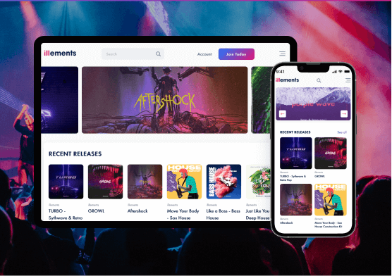
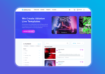
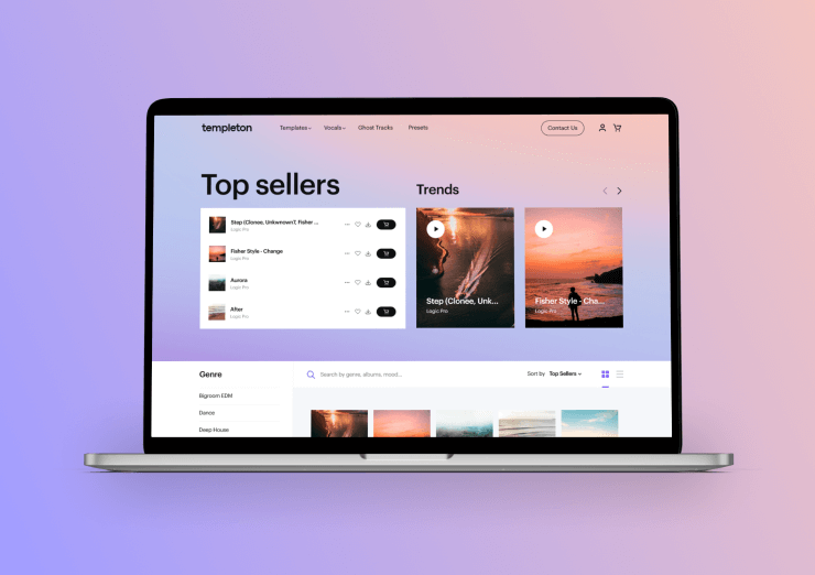
The wise way to sell digital products
We use the mobile-first approach in design, fast loading tricks,
and working CRO techniques to get higher conversion rate
with top positions at Google.
and working CRO techniques to get higher conversion rate
with top positions at Google.
Fast eCommerce with best CRO tactics
Fast loading, mobile perfect designed with simplicity of order is a key in overloader e-comm world.
We design vivid, but easy to use and loading near a second mobile eCommerce websites.
Harry’s is our vision of an ideal store. It has a clear design with nice products, doesn’t overloaded with options and plain checkout.
Fast loading Induces Sales
40% of consumers will leave a page that takes longer than three seconds to load. That is why we design stores which load near a second. According to new Google’s rules fast sites achieve a better position at Google & Google Adwords search results.Work on Any Devices
U.S. mobile retail commerce statistic says than 50% of order done via mobile. As smartphones become more and more accessible to all demographics, these numbers will only increase. Couple that with the rise of ecommerce, and it’s inevitable that mcommerce will not only grow but become the norm.Back to Simplicity
Easy, the less functional and attractive store is where visitors prefer to buy. With informative digital experience that clearly demonstrates the benefits of your goods and quick effortless checkout without the compulsion to register is key to grow sales.Digital Platforms Examples
Let’s work together


